Useful Tip:
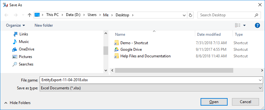
Make sure to apply all of the change you want to the results grid prior to selecting the "Export to Excel" button (See Using the Results Grid for more information).
Attribute Explorer is an XrmToolbox Plugin that will help you analyze your attribute metadata properties. The primary grid provides functionality to show or hide any and all entity metadata. Additionally, you can group, filter, sort and export this information to Excel, the way you want. Helpful when creating data dictionaries or integration mapping documentation. This documentation will help you use this tool and all of its features.
This plugin allows you to access all functionality via the toolbar, located at the top of the application surface.
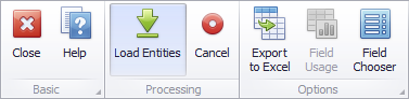
This button will close the Attribute Explorer plugin and return you to the XrmToolbox plugin selection screen.
This button will open the Attribute Explorer plugin documentation in the help window. The help window can also be toggled open and closed with CTRL-H.
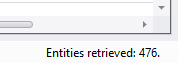
This button will run the process to load all of the entities in the selected
Dynamics instance. You can monitor the progress in the status bar at the bottom of the plugin window.
This button will only be available while the Load Entities background process is running. It allows you to stop and restart the process.
This button will perform the following steps;
Make sure to apply all of the change you want to the results grid prior to selecting the "Export to Excel" button (See Using the Results Grid for more information).
** Future functionality which will count the nuber of records containing data.
Use the Field Chooser dialog to add or remove columns from the grid. Drag and drop these items between the grid column header and the field cooser dialog.
The results grid is a feature rich control that provides a number of ways for you to format your data. See the sections below to determine the option(s) that best fits your needs.
You have the ability to drag the column edges to provide more viewing space. Certain columns have had a minimum widh locked, so you may not be able to shrink these columns below that minimum.
To remove a column from the results grid click and drag a column header into the results grid cell area until the cursor changes its image to a big 'X', then drop the header. You may also Drag and drop the column header onto the Customization Form if it's open.
To add a column open the Customization Form by right-clicking a
column header and selecting Column Chooser.
The Customization Form will be displayed listing hidden columns (if any). Drag the required column from the Customization Form onto the column header panel and drop it at a specific position.
To reorder columns, drag and drop a column header to a new position.
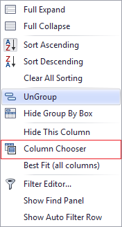
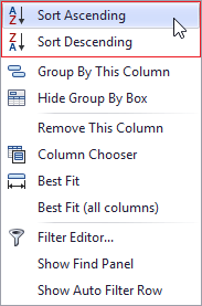
All records in the results grid can be sorted by either pressing in the column header or by using the Results Grid Right-Click Menu
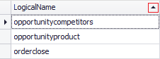
Clicking on the column header will toggle the sorting between
ascending and descending (you will see a corresponding up or down arrow as
well).
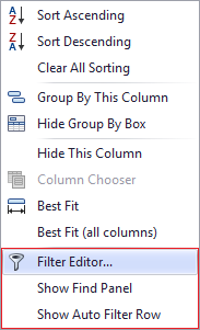
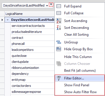
By right-clicking on the column header you can access the Results Grid Right-Click Menu (which
contains access to a variety of functions we will discuss later) the first 2
options allow you to select Sort Ascending or Sort Descending.
To remove sorting by a column, click a column header while holding down the CTRL key.
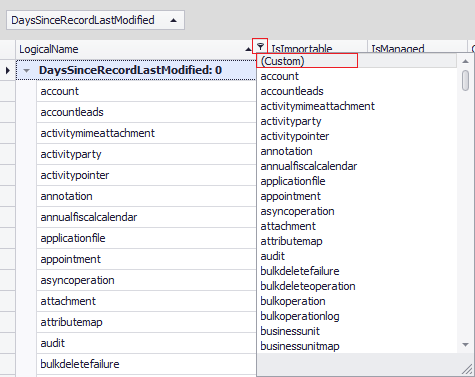
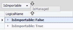
All records in the results grid can be filtered by either selecting the filter icon in the column header, using the results grid right-click menu, using the filter editor or using the find panel.
Hovering over the column header will enable the filter icon where you can select a single value from the list or access the custom filter options.
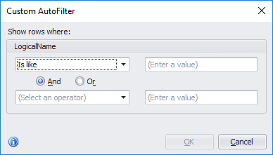
Using the custom filter you can create any number of custom filtering attributes. All of the standard logic options are available to compare against your column data.
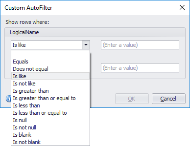
You may also invoke multiple custom filtering attributes using the "AND", "OR" selection.
By right-clicking on the column header you can access the results grid right-click menu which contain several filtering options, including the Filter Editor and the Find Panel.
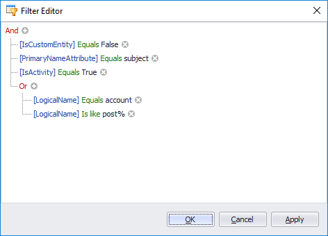
If you have filtered multiple columns, with multiple filtering options and/or filtered other attributes like grouped columns. Your combined filter logic can get pretty complicated. The filter editor is a great place to see all of your filter conditions in one place and change them is needed.
The Find Panel provides an easy way of searching against all the visible columns in the results grid.
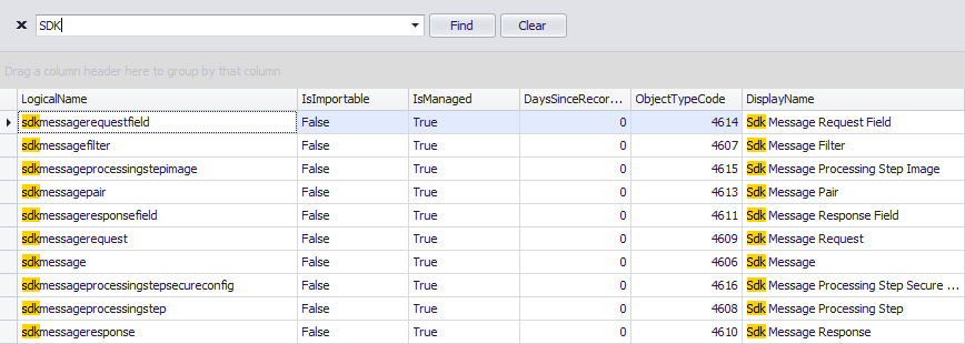
In its simplest form, a search criterion consists of a single word. If you want to search for a string containing a space character, specify this string in quotation marks. Without quotation marks, words separated by the space character are treated as individual conditions.
You can search against a specific column by preceding a search string with the column's display name plus a colon character.
ColumnDisplayName:SearchString
Instead of the complete name, it is possible to partially specify the display name, using the initial characters of a column's display name. A search will be performed against the first column whose display name starts with the specified substring. If you want to search against a column whose display caption contains space characters, specify the column's display caption in quotation marks.
If the search string contains multiple conditions separated by space characters, and at least one condition defines a search against a specific column, only records that match all of these conditions are shown (i.e., the conditions are combined by the AND logical operator). If there is no column specification, records that match at least one of these conditions are shown (i.e., the conditions are combined by the OR logical operator). Precede a condition with "+" to display only records that match this condition. The "+" specifier allows you to implement the logical AND operator. There should be no space character between the "+" sign and the condition.
Precede a condition with "-" to exclude records that match this condition from the result set. There should be no space between the "-" sign and the condition.
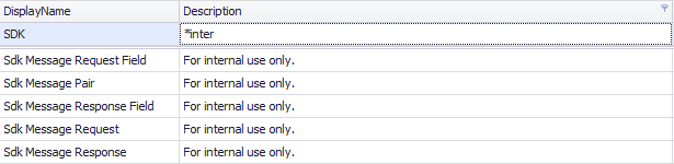
| Search Criteria | Description |
|---|---|
| account | Selects records that contain the "account" string in any search column. |
| account contact | Selects records that contain either "account" OR "contact" strings in any search column. |
| "internal use only" | Selects records that contain "internal use only" in any search column. |
| account + contact | Selects records that contain either "account" AND "contact" strings in any search column. |
The automatic filtering row allows data to be filtered on the fly by typing text into that row.
This row is displayed above regular data rows and allows to type in filtering values (including '*' and '%' wildcards).
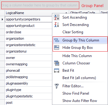
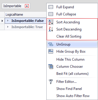
By default, when you group data by columns, these columns automatically hide from the View, and all groups collapse.
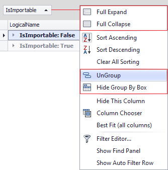
To ungroup your data, either drag the column from the group panel back to the column header panel, or right-click on the column in the group panel to access the group panel right-click menu to use the grouping features.
You can choose to add multiple columns to group your data. To do so drag a column header into the group panel above or below an already existing column.
Available by clicking on the arrows within the result grid or selecting the corresponding options from the group panel right-click menu.
All of the same sorting options are available for grouped columns as exist for regular columns. These are available by clicking on the arrows on the grouped columns or selecting the corresponding options from the group panel right-click menu. For more information please see the Sorting section.
All of the same filtering options are available for grouped columns as exist for regular columns. These are available by clicking on the filter icon on the grouped columns or selecting the corresponding options from the group panel right-click menu. For more information please see the Filtering section.